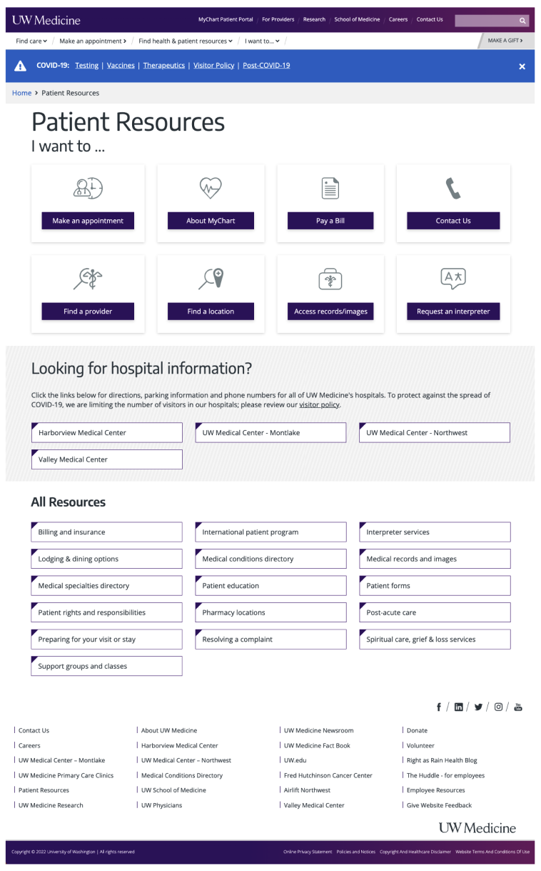
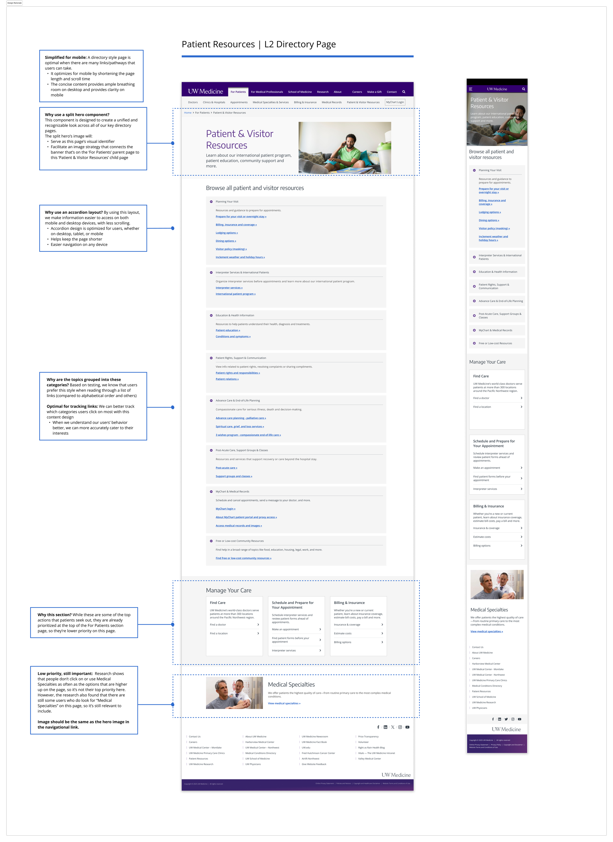
Patient & Visitor Resources Pages
Project background
We launched a new navigation on uwmedicine.org in April 2025. The new nav changed the IA on our site, now it’s organized by audiences that we serve:
Patients
Doctors
Researchers
We need a new patient-focused landing page in the L2 of the nav.
Due to the new nav design, the Patient Resources page will have elevated visibility, likely higher traffic and user reliance.
The existing patient resources page was designed 15 years ago, and had a few key problems:
Old components that had accessibility issues
Missing important information and links
Didn’t align with other audience-focused pages in the L1 navigation
We set out to build one or two pages that act as a comprehensive resource, providing patients and visitors with top patient-related actions and resources.
Context and challenge
Team:
Product designer
Data scientist
Web team
Developers
Program manager
Tools
Figma
UserTesting
Google Analytics 4
SEMRush
SiteImprove
Microsoft suite
Audiences for the page(s):
Current patients
Prospective patients
Proxy users
Challenges:
The current Patient Resources page is cluttered with 32 links/CTAs to other pages. We don’t currently know which links/CTAs have the highest/lowest click rate, and therefore the subjects that patients are coming to this page to find.
Leadership wanted all patient and visitor information on one page, instead of split into two
Leadership wanted the For Patients page as the Homepage, which would break the interaction design pattern of the L2 navigation, therefore may be confusing for users
Goals
User goals:
Clear language and pathways to subjects most important to patients (i.e. make an appointment, find a provider, estimate costs)
Business goals:
Elevate MyChart login and About MyChart page, increase logins by 5% (new and current patients)
Ensure visibility of high priority areas, medical specialties and urgent care
Make patient forms easily accessible i.e. Notice of Privacy Practices
Ensure that we cater to both new and existing patients
UX goals:
Through data collection and analysis, understand the search keywords that lead patients to this page and top patient-related subjects/clicks across the site
Implement semantic hierarchy, prioritizing top patient subjects/actions at the top of the page
Clear user journeys with minimal clicks to help patients accomplish tasks or expand their knowledge in a particular healthcare-related area
Through user testing, understand what patients expect to see, and if a one page or two-page experience is preferred. Identify priority subjects and secondary subjects.
Change the buttons on the page to links
Personal goal:
Experiment with ChatGPT to speed up user testing data analysis and any other tasks that it seems appropriate
Process
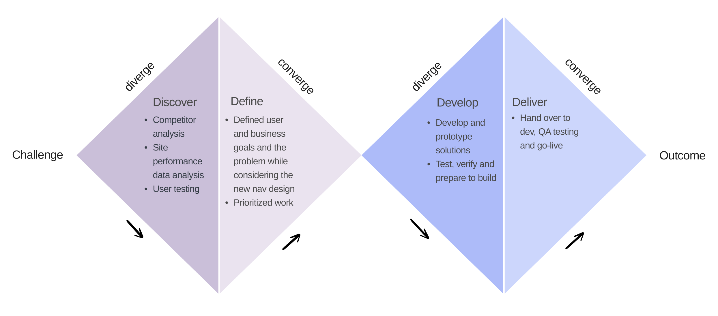
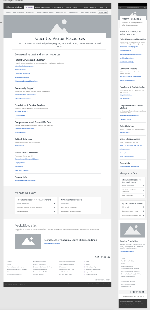
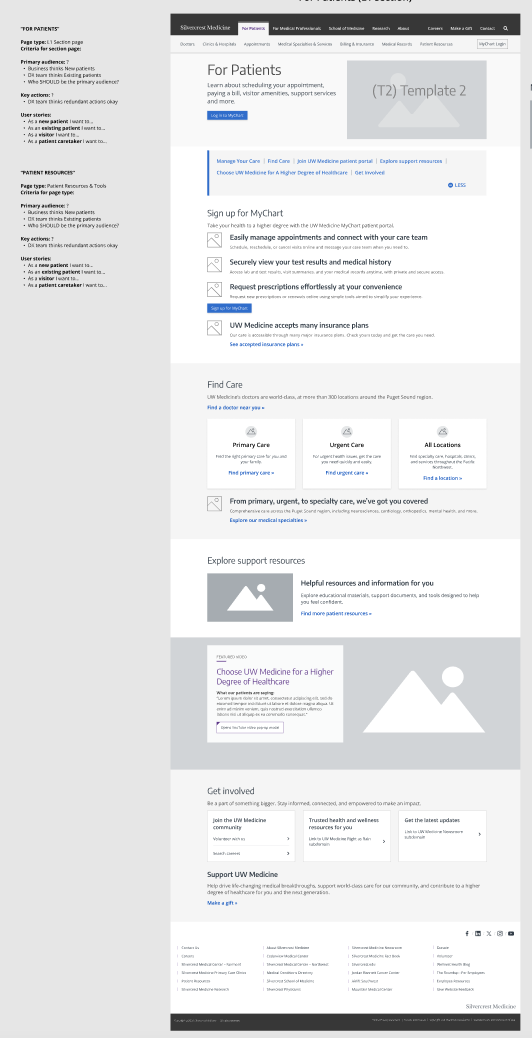
Old design
Note: The For Patients page was an entirely new page, but the Patient Resources page was a redesign project
CY23 and CY24 data collection and analysis:
SEMRush, SiteImprove and GA4
Search data that lead to the Patient Resource page
Patient resource page data
Homepage navigation data
2. Competitor analysis:
Swedish
MultiCare
Virginia Mason
Mayo Clinic
Cleveland Clinic
Seattle Children’s Hospital

Data insights
3. Top patient-related topics from search and site clicks:
Find a doctor
Find a location
Make an appointment
Insurance and coverage
MyChart login
Estimate costs
Most competitors prioritize these topics
4. Topics of secondary importance:
Lodging options
Patient education
Interpreter services
Post-acute care
…and more
User testing insights
Test logistics
Usertesting.com
Unmoderated preference test
Mobile and desktop designs
8 users
4 native English speakers
4 non-native English speakers
Test insights
A two-page design is more inclusive
62% of users preferred the two-page design
60% of those users were non-native English speakers
Why users like it better
Less scrolling
More descriptive text that set accurate expectations
The main section page had more important info for all patients, while the L2 page had less critical info
Clear topic headers and more descriptive text helped orient them
Using AI to speed up user testing analysis
Used ChatGPT to analyze user test results - cut down what typically takes 3 - 4 days only one day

Content outline, design iterations & stakeholder feedback
Developing the content outline using ChatGPT:
I entered the top patient topics discovered in the data analysis phase and during user testing into ChatGPT and prompted it to create a content hierarchy
After entering a few more prompts that requested topic headers and hierarchy, I had a solid draft of the content outline with strong web page semantics to ensure accessibility, SEO and readability
After numerous iterations and receiving key stakeholder feedback:
I lead the presentation of the final design and working with the designer, added in design rationale next to ea
Add key stakeholder feedback
Goal outcomes & learnings
User goals:
Clear language and pathways to subjects most important to patients (i.e. make an appointment, find a provider, estimate costs)
Business goals:
Elevate MyChart login and About MyChart page, increase logins by 5% (new and current patients)
Ensure visibility of high priority areas, medical specialties and urgent care
Make patient forms easily accessible i.e. Notice of Privacy Practices
Ensure that we cater to both new and existing patients
UX goals:
Through data collection and analysis, understand the search keywords that lead patients to this page and top patient-related subjects/clicks across the site
Implement semantic hierarchy, prioritizing top patient subjects/actions at the top of the page
Clear user journeys with minimal clicks to help patients accomplish tasks or expand their knowledge in a particular healthcare-related area
Through user testing, understand what patients expect to see, and if a one page or two-page experience is preferred. Identify priority subjects and secondary subjects.
Change the buttons on the page to links
UX goals: The old page had 32 buttons. The new page identified the top patient-related actions and business priority page, and minimized the number to 18 links on the page.
Personal goal: Success!