For Patients and Patient & Visitor Resources
User Testing
Tests:
Usertesting.com
Unmoderated preference test
Mobile and desktop designs
8 users
4 native English speakers
4 non-native English speakers
They were asked to give feedback on things like…
Expectations, comprehension and preferences
Where would they go to find information about theircare?
What did they expect to find on the For Patientspage and the Patient Resources page?
Did they understand what the topics mean or werethey confused by any of them?
Which design do they prefer, the one page or two-page? Why?
And many more...
High level insights
A two-page design is more inclusive
62% of users preferred the two-page design
60% of those users were non-native English speakers
Why users like it better
Less scrolling
More descriptive text that set accurate expectations
The main section page had more important info for all patients, while the L2 page had less critical info
One page design
Users expected to see the topics on the For Patients page
Users appreciate that MyChart is prominent
They mentioned insurance info, billing, appointments, doctor info, portal login and conditions
They did not mention any topics that they felt are missing from the page
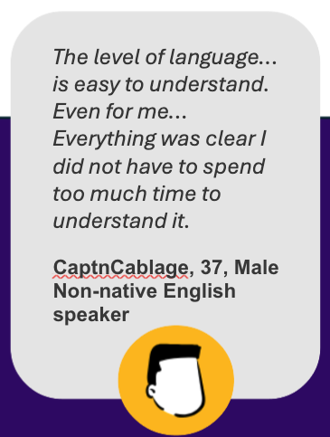
The page is easy to understand with simple English
Their overall impression was that naming and hierarchy is well-organized andcomprehensive
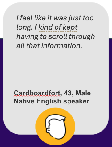
The concern: Significant scrolling and reading is required
Some users were pleasantly surprised at how comprehensive the info is
Users prefer including the word “visitors” in the title, edit to “Patient and Visitor Resources”
Users expect the page to be a comprehensive list of all patient-related categories that assist them outside of direct provider care
What users said about the one page design
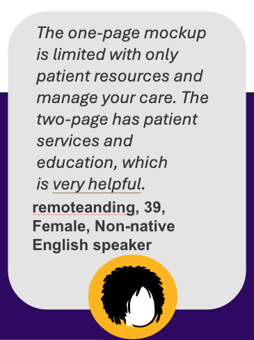
What users said about the two page design
Most users expected to see the topics shown on the two pages
Users noted that the section page seems simplified and shorter
All users expected this info since it was similar to the previous mockup
The two-page experience is straight forward
When asked where you would go to find more information or support for patients,all 8 users either cited the link at the bottom of the section page under SupportServices or the nav, often citing both as options.
Their overall impression was positive
Clear topic headers and more descriptive text helped orient them
Some users were pleasantly surprised at how comprehensive the info was on the page
The concern: The L2 in mobile is hidden and does not allow for expectation-setting(although this occurs at the bottom of the section page)
Two page design - what users had to say
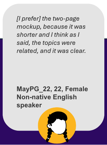

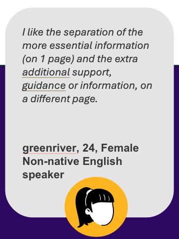
The two page design had better UX and performance
2-Page Design
Pros
Less scrolling: Shorter page length = faster load times.
Aligns with the site's mental model: Follows the existingstructure, consistent with other sections of the site.
Aligns with the new navigation model: Follows the setup andstructure of the new navigation.
More streamlined & easier to navigate: Prioritizes relevant, high-traffic topics and de-prioritizes less clicked items based on user behavior data.
More descriptive text: Sets accurate expectations for users.
Reduces content overwhelm: Help users focus on key informationwithout feeling overloaded.
Scalable for future growth: Adding topics to a 2-page design avoidsbloat and maintains a cleaner layout.
Clear separation of content: The section page provides importantinformation for all patients, while the L2 page covers less critical topics.
Cons
Mobile design limitation: The L2 menu can't include descriptive text,which may limit user clarity.
Maintain two pages vs one page
1-Page Design
Pros
No L2 concern on mobile: Skips the L2 menu issue but also limitshow much context users get.
Maintain one page vs. two pages
Cons
More scrolling: Longer page = slower load times.
Doesn't align with the site's mental model: Inconsistent withother areas where less relevant topics are de-prioritized.
Less streamlined & harder to navigate: Includes lower-prioritytopics, based on user behavior data, that receive less engagement, increasingclutter and reducing clarity.
Less on-page descriptive text: Excessive or vague text can confuseusers and create unrealistic expectations.
Increases content overwhelm: Too much information makes itdifficult for users to focus on key details, potentially causing frustration andincreasing the risk of churn.
Not scalable: Adding more topics increases clutter, making the designharder to maintain long-term and overwhelming users – this is already achallenge on the current page today.