Standard Urgent & Emergency Care Message
UW Medicine
UW Medicine’s mission is to improve the health of the public. It’s a hospital system that includes a top-rated medical school and an internationally recognized research center. We have ~500,000 website visitors every month, and ~1.6 million in-person and telehealth patient visits annually.

Project background
My Role: Project Lead and Content Designer
Tools: Epic MyChart, Word, PowerPoint
Team: IT Analyst, Program Manager, Clinical Oversight Committee and the Associate Medical Director of Urgent and Primary Care
Timeline: 2 months
User Goals:
Create a simple, consistent message that considered all scenarios where patients should seek urgent and emergency care
Increase patient safety
Add to the beginning of flows instead of at later stages
Ensure patients are aware that they should not use MyChart for emergencies
7th grade level
Minimize and define medical jargon
Business Goal:
Standardize emergency and urgent care message across all touch points for consistency to mitigate patient health risk
Background:
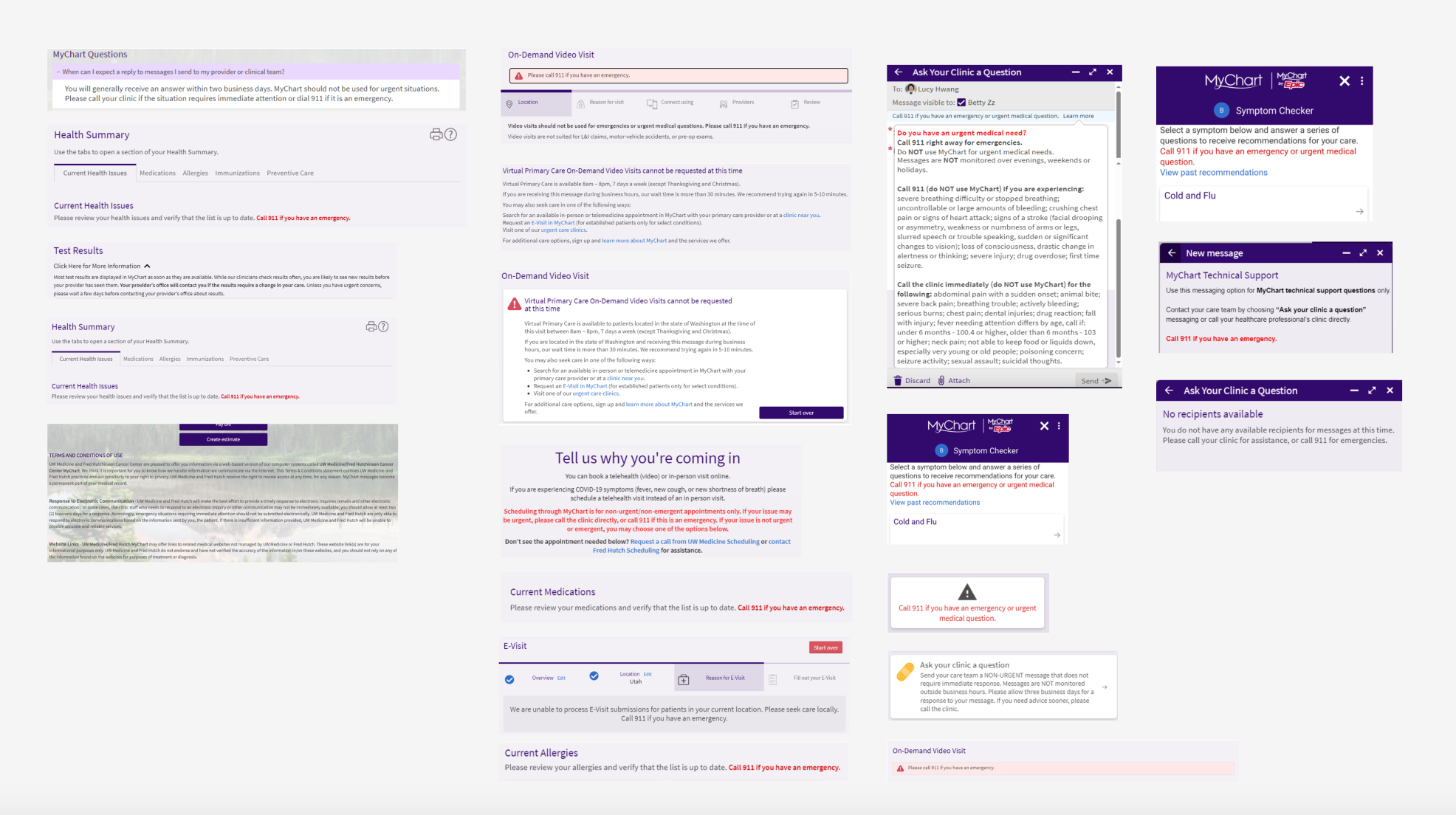
The urgent and emergency care message was inconsistent across the MyChart app and uwmedicine.org.
There were many different versions of the message that showed up across the website and app. The inconsistent messages were directing people to call 911 or seek urgent care based on different scenarios.
Recommendation
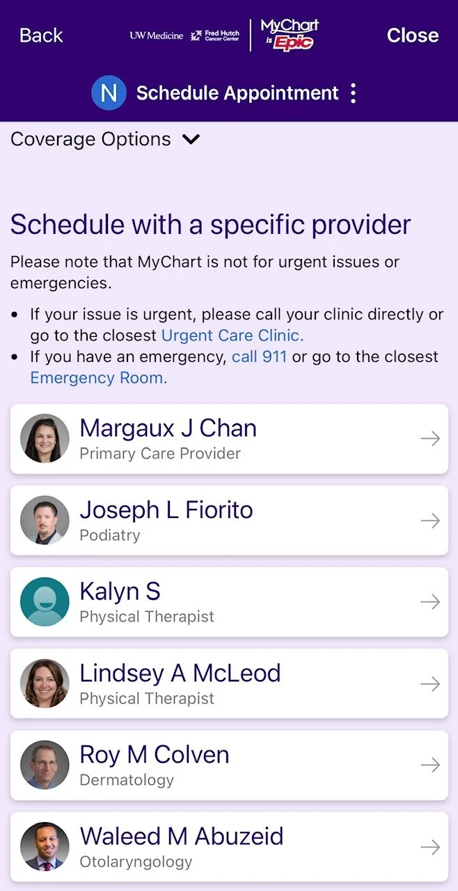
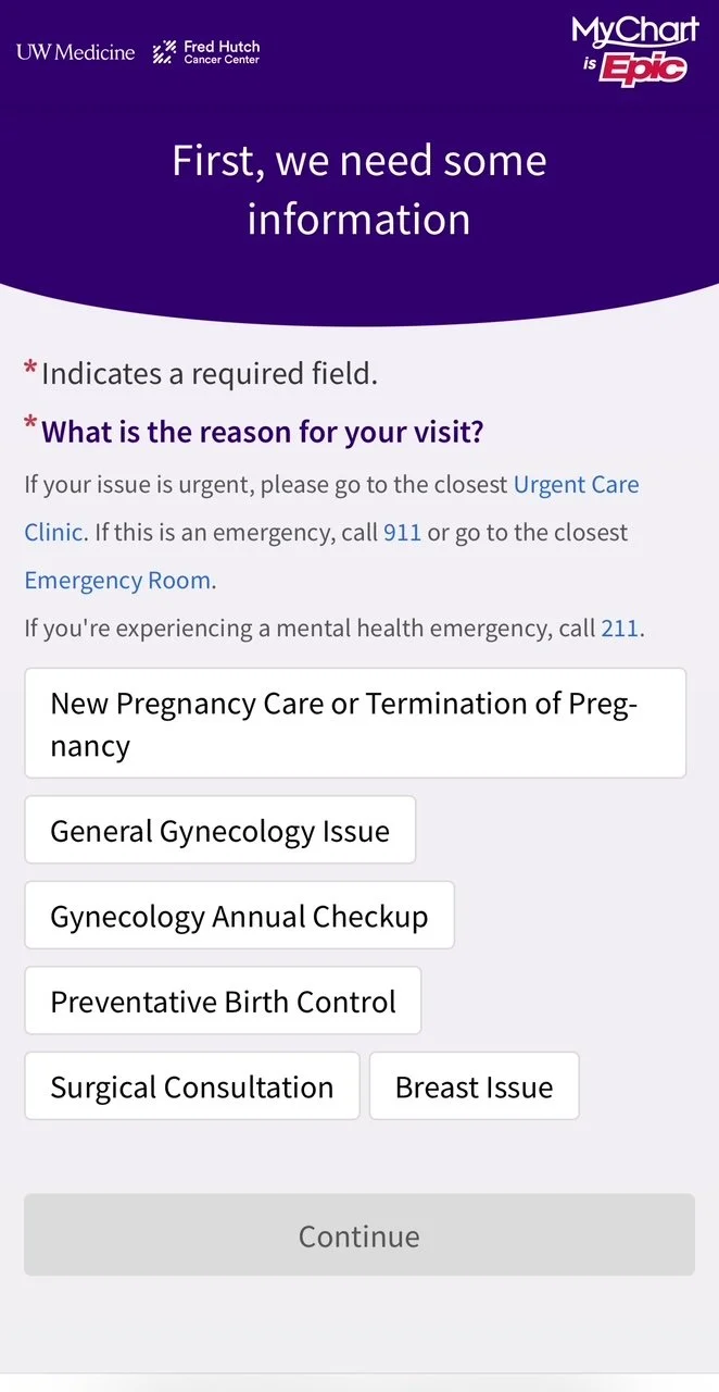
In the MyChart app
The message was added to 9 different key areas in the MyChart app.
Note: MyChart is an out-of-the box app and has a list of design constraints. When adding this content into the app, I had to work within these constraints.
ADD homepage and flow to these screens including the website steps in the flow
MyChart appointment scheduling on uwmedicine.org.
How I developed recommendations
What: I conducted an audit of MyChart and uwmedicine.org to capture all of the areas an urgent and emergency message appeared.
Why: To capture every version of this message to analyze overlapping and contradictory messaging.
What I learned
There were three problems that I found:
There are 13 versions of the message across the website and app and only a few of them linked to a 911 phone call.
Most of the messages didn’t describe the different scenarios of when a patient should go to urgent care vs. emergency care.
A few of the messages were too long and took up significant space.
UX Writing drafts
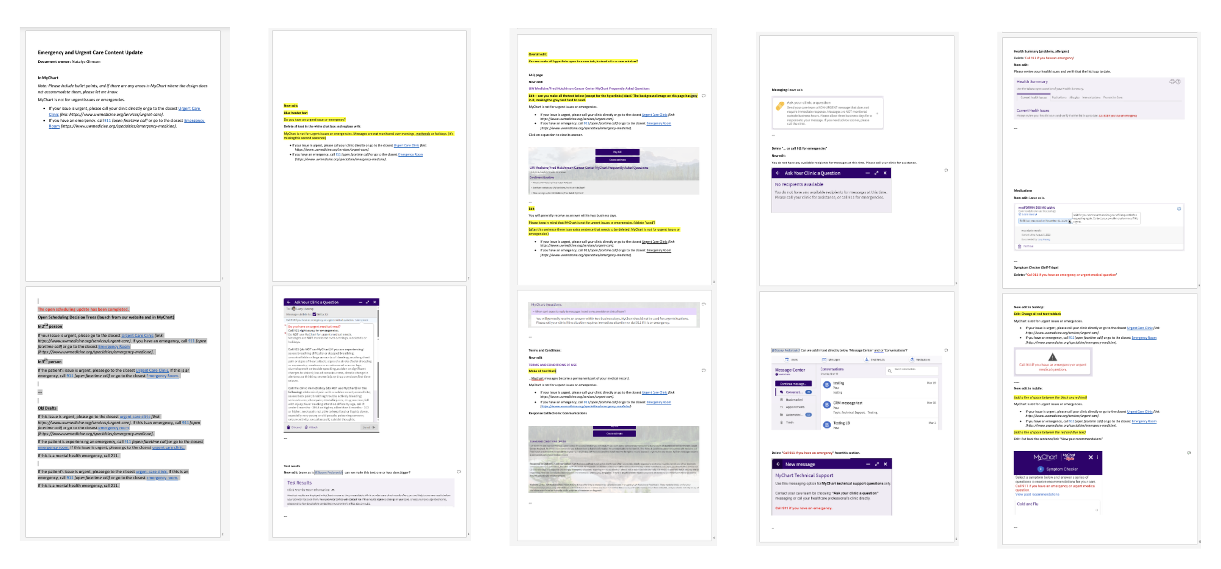
Stakeholder feedback
I presented my recommendations to the Clinical Oversight Committee.
There were many different opinions to work through — some thought the message should include some examples of when to go to urgent care and emergency care.
I showed them examples of longer messages and showed that it would take up too much space on mobile.
ADD powerpoint
Stakeholder sign-off & go-live
After showing examples and the negative experience they they would create, I achieved consensus from the committee.
Associate Medical Director of Urgent and Primary Care gave final sign off on the message.